
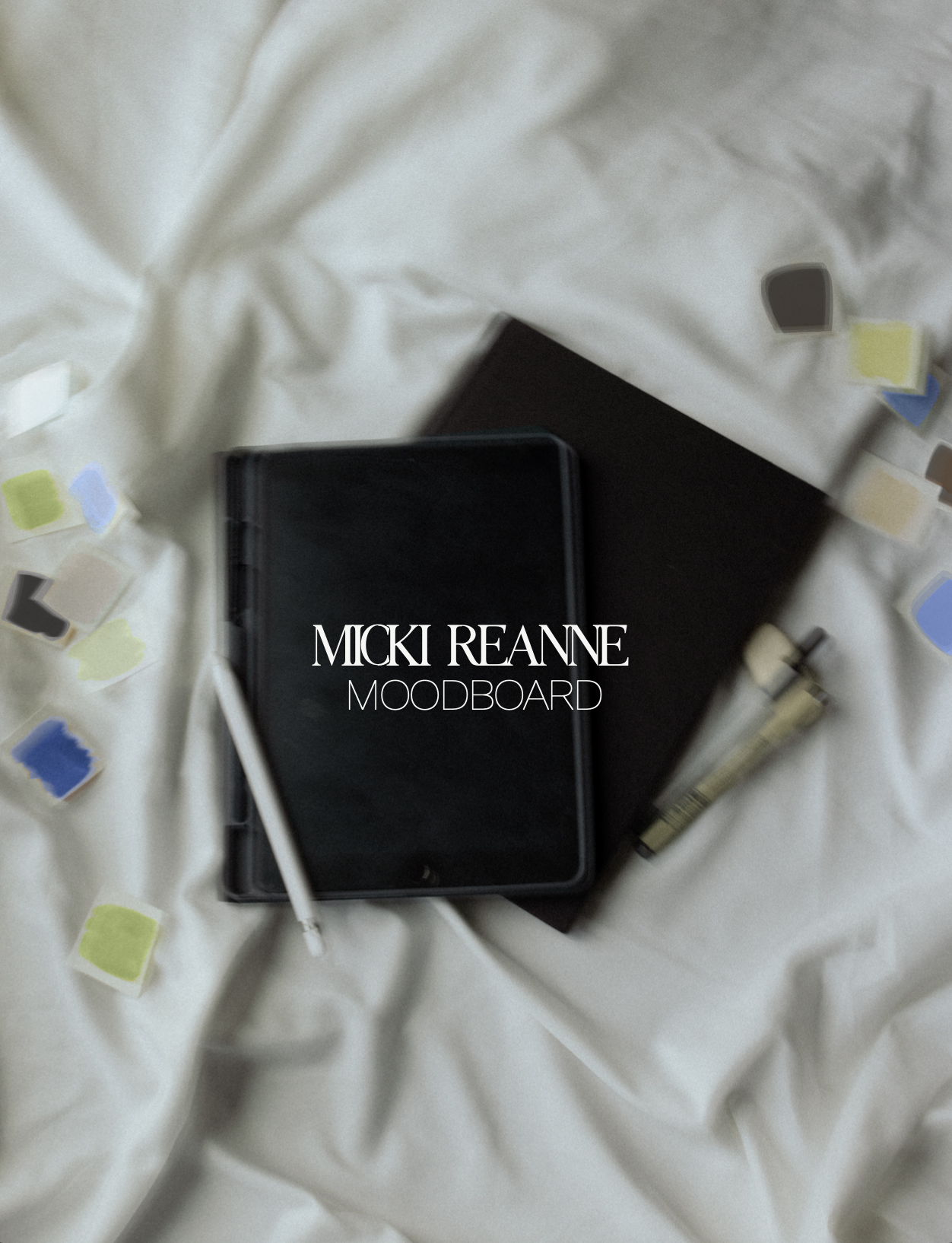
Brand Design Suite: Micki Reanne

unique brand design
creating a brand design suite for chaos’ worst nightmare—the girl bringing function back to aesthetic.
about micki
Micki is a Notion Systems Creator on a mission to bring function back to aesthetic.
Micki uses Notion to build out fully functional backend systems for the CEO that’s just getting by. She’s chaos’ worst nightmare. All about making the high maintenance investment for the low maintenance every day experience. She is THE source on Notion for the everyday entrepreneur. She honestly blows me away. She has this insane ability to take a blank page and give you a system that supports you and gives your inner chaos a place to rest.
brand voice
Micki’s brand voice centered around the idea of the clean girl aesthetic. Polished with a masculine twist. She speaks to the evolving CEO that needs a little extra support to keep up their pace in a sustainable way. Her brand is approachable while also being inspirational and something to aspire to—that is a delicate balance.
the visual vibes
Micki was looking for a bit of a refresh—she had a color palette she LOVED, but the rest of her brand no longer aligned with the direction she was moving her business. We were going for that clean girl aesthetic, polished, balance of masculine + feminine, unique, and creating some depth. Micki ALSO really loved the idea of stickers—like flash tattoos, sticker sheets vibe. I had SO much fun giving Micki all of her logos and elements in sticker form.
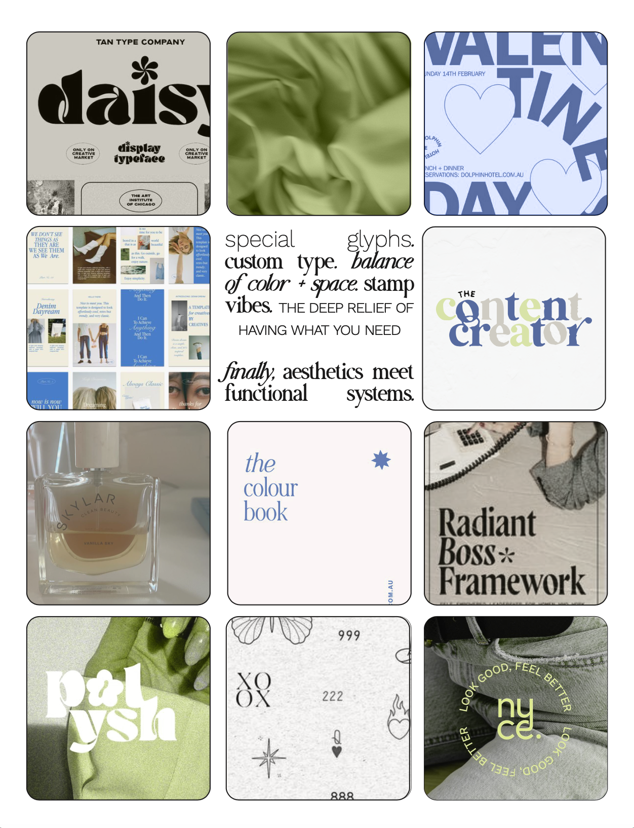
Micki wanted to keep her color palette mostly the same, with this striking blue and bright green. For her moodboard, I took photos from her Pinterest board, adjusted the colors to reflect the direction I would be taking the brand, and notating the important takeaways from her inspiration.
I sent Micki her moodboard to make sure we were on the same page about what’s most important for her brand. With her approval, I moved forward with building her brand—starting with brainstorming and sketching.
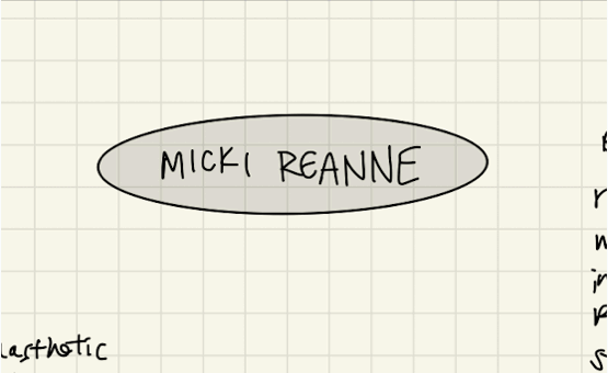
Brainstorming & Sketching
It all begins pretty rough. Spending a lot of time in this stage makes for a really strong, unique brand. It’s messy and tends not to be shown with the buttoned up pieces of a brand, but I love showing the humble beginnings. What is life, if not messy?
concept delivery
Before finalizing all of her files and brand guidelines, I shared my concept with Micki! I created a video explaining the thought behind her new visual identity and sharing the work I had created.
With Micki’s concept approval, I went on to offload her files in all the colors and file types which you can see below!
THE FINAL BRAND
primary logo
I really wanted to focus on unique letterforms, intertwining letters, and representing what Micki does to the subconscious. Giving the e a tilt as it nestles into the n as a nod to how Micki puts chaos in its place. It communicates all these ideas without you even realizing it.

lettermark
Micki’s previous brand had a lettermark that she liked, but it wasn’t always easy to use because if its contrasting thick and thin lines. This is why responsive logo suites are SO important. You should have a logo that works in big, medium AND small sized settings. And ones that work well horizontally and in a circle/square. The most important logo versions should be adaptable to different sizes for versatility.

submark
I wanted Micki’s submark to fill that circle/square logo option and focus on transformation. The transformation Micki brings to every build is quite awe-inspiring. The butterfly is classic symbol of transformation, going from caterpillar to butterfly. Some of my earlier sketches played with the idea of a cocoon, but I love the idea that Micki’s clients can identify themselves in this logo version—they are the butterfly that will be flying through the open air after the transformation they have with her. She can give them their wings. The butterfly is what they can aspire to be.
logo suite
Micki’s logo suite also included a supplementary logo option which combined her lettermark and the butterfly imagery and an alternate logo which went in a different direction using her complimentary font and the telephone element!
You can see a bunch of the different color versions in the gif here which shows her final file hub!

brand elements
I may have had a little too much fun creating elements for this brand. I found the illustration style that worked best and ended up bringing quite a few of my ideas to life! They each add something unique to the brand—the perfume bottle like the final touch of a system that works, the cup and flower vase showing that clean girl aesthetic and pulling in the positioning. It all has intentional purpose and brings personality to her brand that would have otherwise stayed hidden.

brand patterns
I have found brand patterns to be such a useful part of a brand. While they aren’t the most stereotypically functional piece of a brand, they are amazing for creating brand recognition and adding to the personality of a brand.
Micki’s included a bunch of customized gradients, some texture options, a composite of her brand elements, and a nod to Notion—the rounded shapes are actually hand drawn loose letterforms which spell out Notion!

The Taglines
A brand is made up of words just as much as anything else.
Taglines are easily repeatable phrases that effectively communicate your brand without being a million pages long. Micki’s included “Systems as signature as your scent”. “Where function meets aesthetic”, “Your system called. IT SUCKS.”, and “Give your chaos a place to rest”
I love giving my brands options for taglines that communicate the complexities of what the brand stands for. Brand voice is SUPER important to my projects. Branding and marketing can feel really cold. A brand voice is a way to humanize the brand. Sometimes it feels as though brands are forced through this professional filter—like someone vacuum sealed the life out of them (too much stuff, not enough space??? is that you???). I like to think I do the opposite of that.


a peek at micki’s final file hub:

unlock your brand’s design
Your brand is as unique as you are. It has a soul, but chances are outsiders aren’t seeing it. You may understand it, but no one else does. Brand design in my world is all about illustrating your brand’s soul, your unique magic, and showing your genuine offer of value. Because we aren’t tricking people into giving us money. We are giving them a transformation, a new version of themselves, it’s an exchange of value that words may never be able to describe how wonderful and important it truly is. So, click the button and let’s unlock yours.